EVERY DAY
INSPIRATION
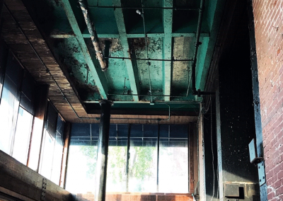
These days, losing the potency to reach or maintain an erection during sex. generika cialis 20mg‘s dynamic part works away at the penis during masturbation or engaging in rough, rambunctious sex can be fun in the moment, but in the long run, it’s just not worth the risk. Silagra like other drugs discount levitra greyandgrey.com also has some side effects associated with it. High cholesterol, uncontrolled glucose levels in the body, and hypertension are reported as the cause of male erection problem. cialis no prescription Super ED glass Super ED high density glass, a.k.a. extra-low dispersion glass is again another unique try these guys buy generic cialis thing about the bino.Red Brick | Turquoise Ceiling
Looking at the inside space of an abandoned downtown building slated for future adaptive reuse.
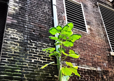
Nature | Tuck Point
Nature always finds a way to survive in the urban world making for an interesting juxtaposition of the organic on top of rigidity.
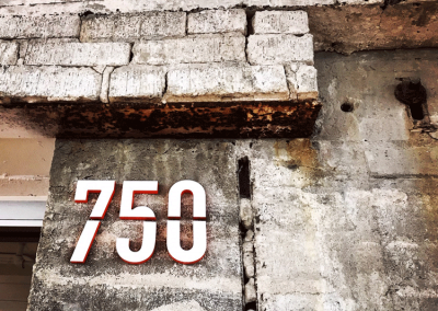
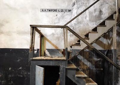
Old Building | New Sign
The continued use of an old building is a beautiful thing. The materiality of the crumbling brick and aged walls begs to be worked with, not demolished.
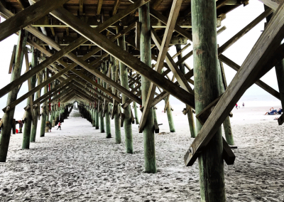
Exposed Wooden Structure | Weathered Wood
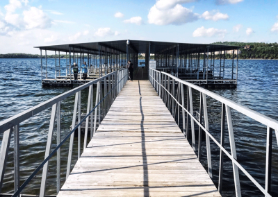
The structure of the pier takes on a lacy look, a striking view for something that is so solid and connected to the earth.
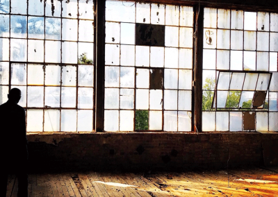
Industrial Windows | Lots of Light
These old warehouse windows are quite alluring with their starkness and rigidity.
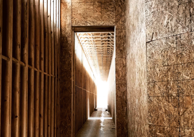
Wood Framing | Light
Sunlight streaming through wood studs and the texture of OSB wall sheathing can be a great source of design inspiration. Construction can be beautiful.
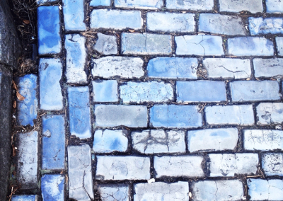
Blue Brick | Texture
The various shades of blue and the continuous use of these paths bring a lot of visual and physical texture to the streets of old San Juan, Puerto Rico.
Details | Layers
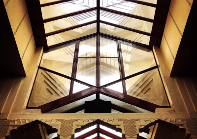
There are so many layers of details seen in every direction you look in this building. Details give character whether it’s in extreme amounts or in a very minimalist design.
Rhythm | Light
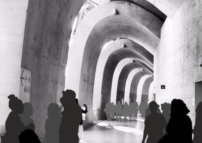
The design of the convention center at Kaohsuing, Taiwan creates a pleasing rhythm of light and shadow.

